One of the most significant players in the creator growth economy – valued at over $3 billion – wanted to overhaul a recently acquired AI video editor. The editor could automate editing long-form YouTube content to short-form: TikTok, Instagram, Facebook, etc.
We were tasked with redesigning the tool for widespread use – integrating novel features and overhauling the existing UX.
01
OVERVIEW
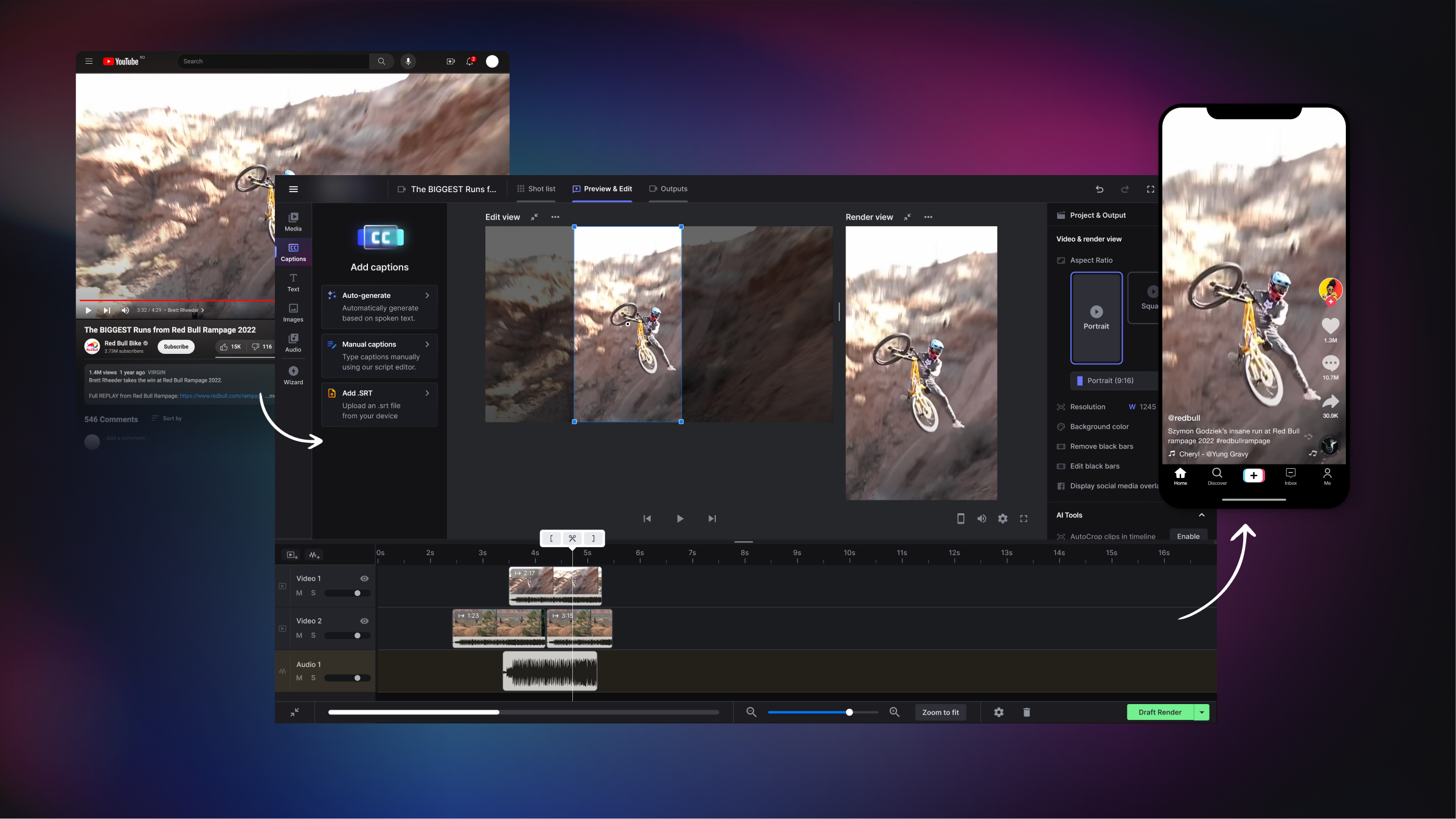
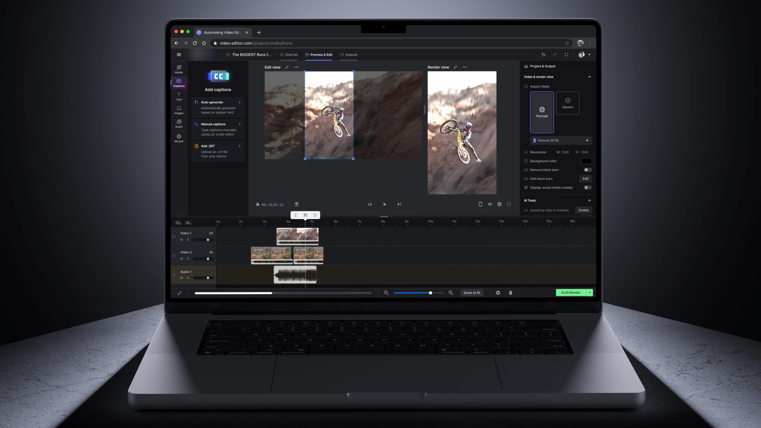
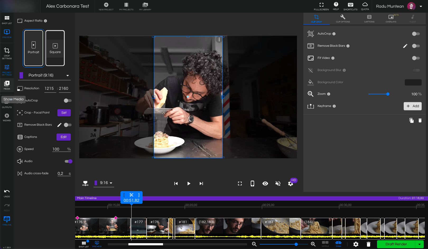
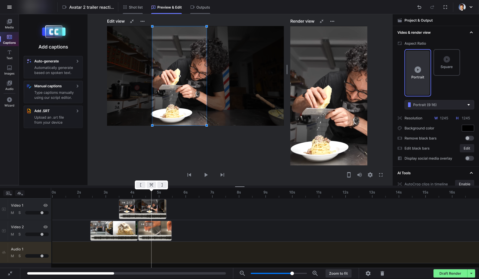
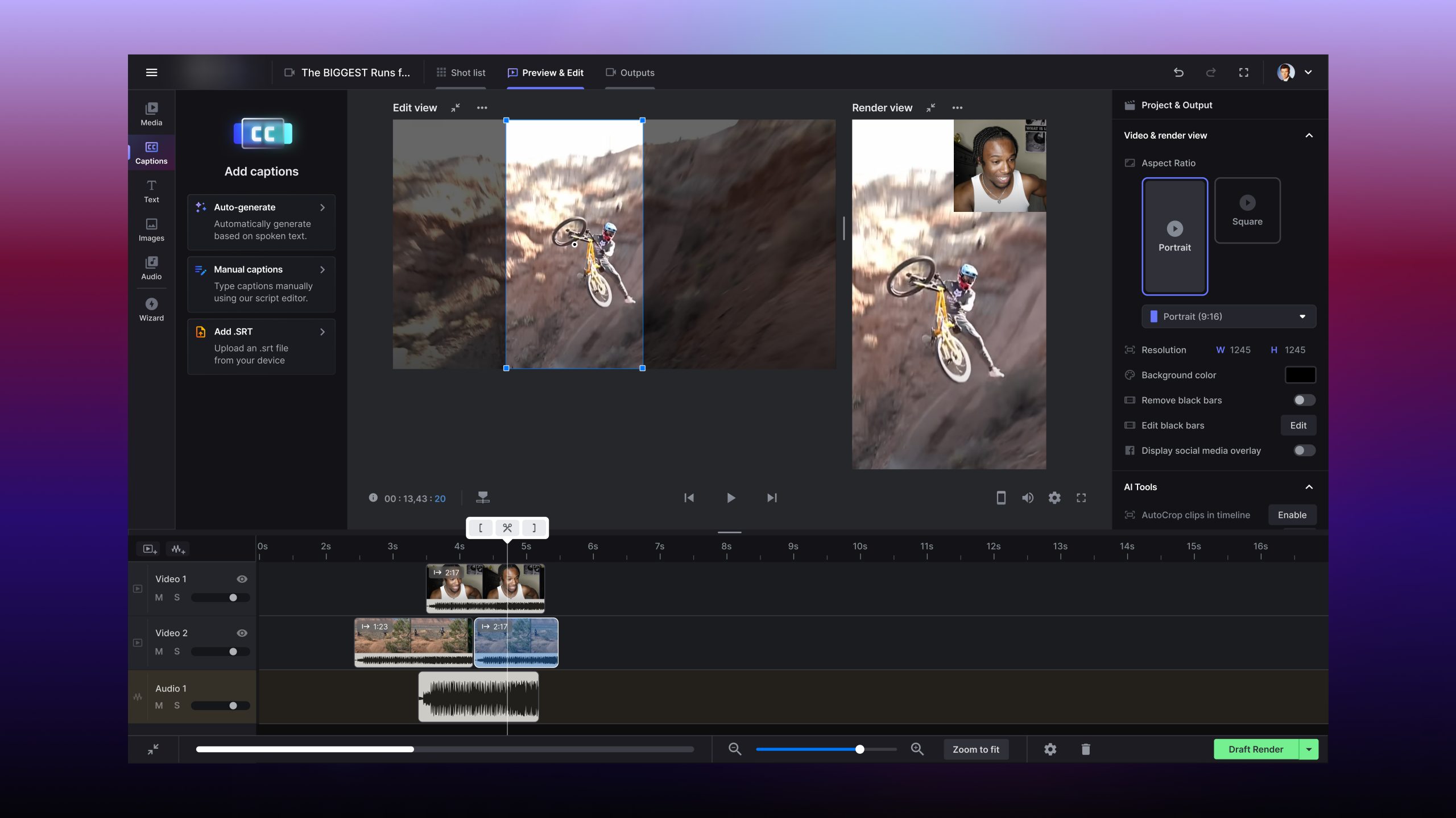
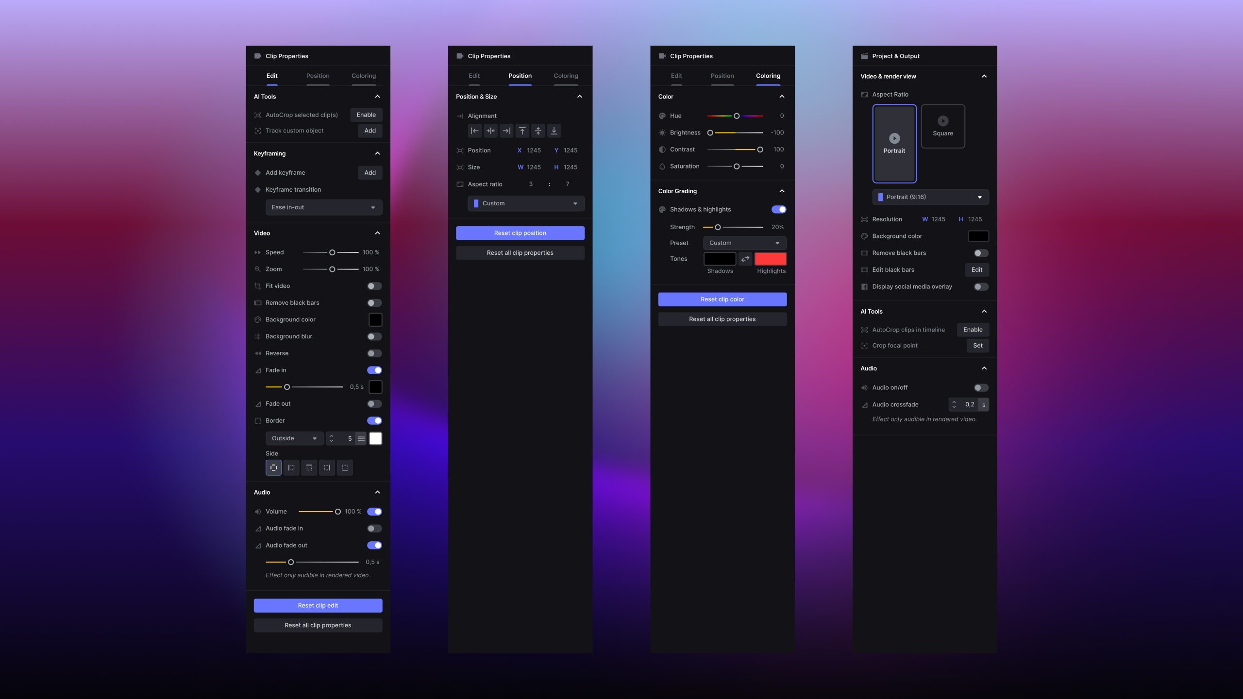
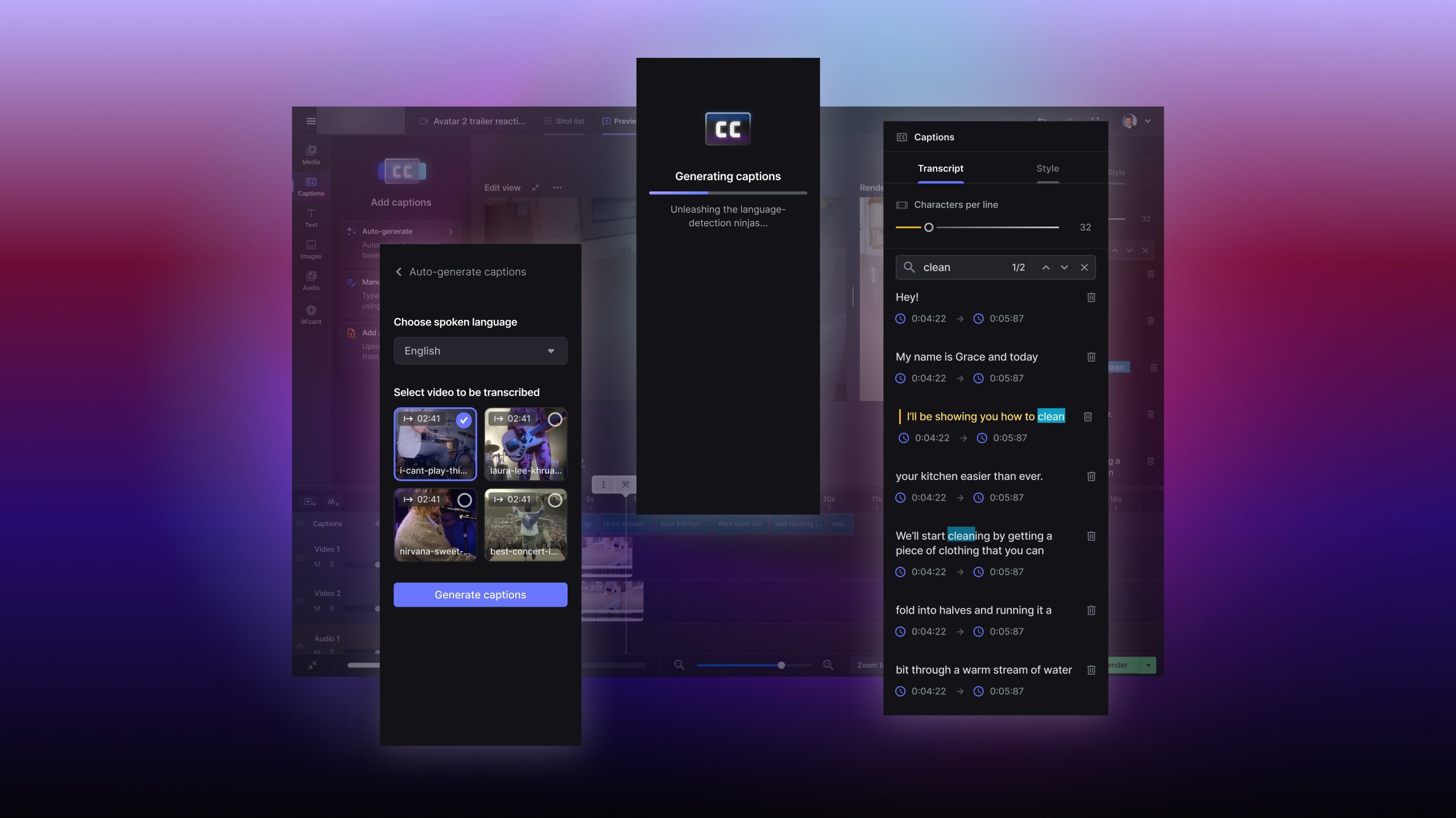
A web-based video editor that – in its existing form at the time – could already auto-track objects, auto-cut, and identify points of interest in the video using AI & ML – and use that to reframe content from 16:9 YouTube format to vertical reels automatically.
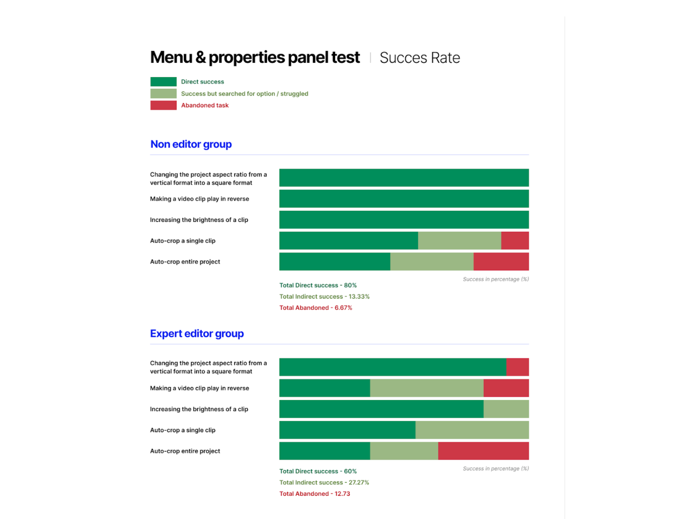
The client’s business model relied on content production and creator growth across social platforms – and adapting videos to shorts was a key revenue generator. However, they employed highly skilled editors to do this, which significantly limited this output.
Their new acquisition wasn’t by chance: the tool could streamline the process, save on editing costs, and increase content production. However, it missed key UX features before we could roll it out for widespread use.
On top of streamlining the internal editing process, our redesign would enable a release to the market. In a $22 billion post-production market, a self-serve editing tool that targeted non-editors presented immense potential to creators, editors, and marketing professionals. With over 60bn minutes of footage already on YouTube, there was a significant untapped market in efficient reframing editors for short-form content.
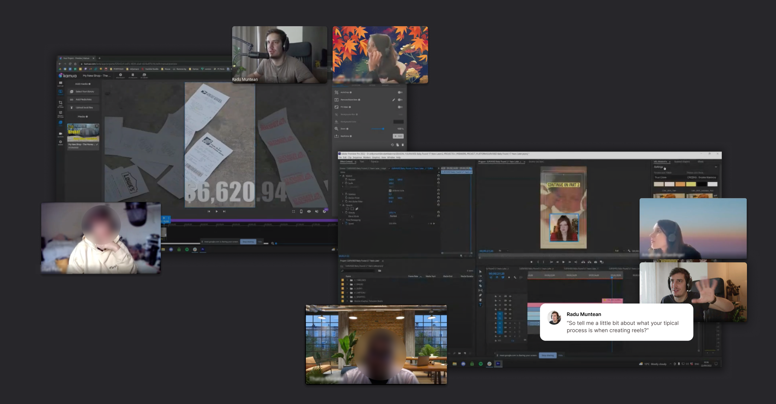
I led the redesign between June 2022 and Dec. 2023, closely collaborating with the PO and our Sr. UX Researcher to achieve this, alongside a team of 9 engineers. As a product designer, I defined the redesign strategy, including research, roadmapping, feature selection, and visual direction.
My background in audio engineering and music, familiarity with audio-video tools, and experience in designing other apps in the audio space gave me a considerable advantage during the project’s lifetime and was a contributing factor to my joining the team.
02
DESIGN PROCESS
–and bring some UX improvements along the way, too 🤠
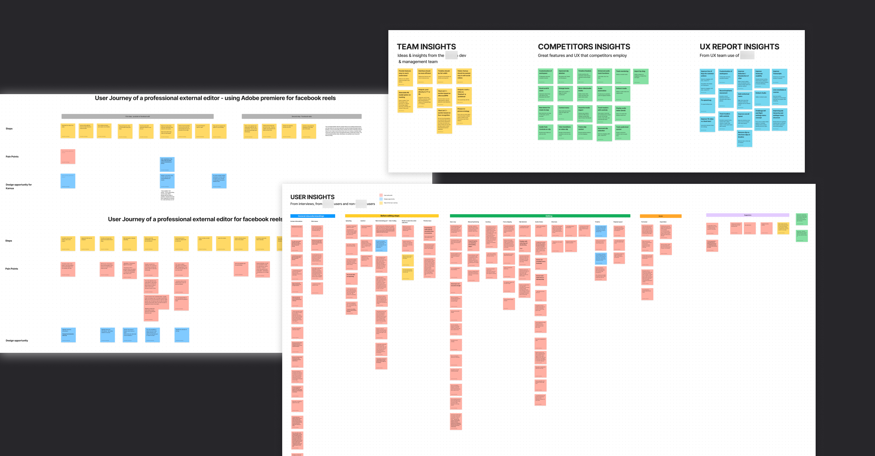
My goal for us was having a framework that suited our needs: we had to take multiple areas of research into account, be able to digest vast amounts of information, and turn those into a workable feature list that would ultimately define the MVP. The framework could then guide us into a clear design & development strategy.
Since we worked with an existing product, the solution was not just about creating new features – but also about weaving them with a coherent new user experience, along with improved interactions and behaviors, navigation, interface structure, and information architecture changes.
We decided on an adapted double-diamond framework.
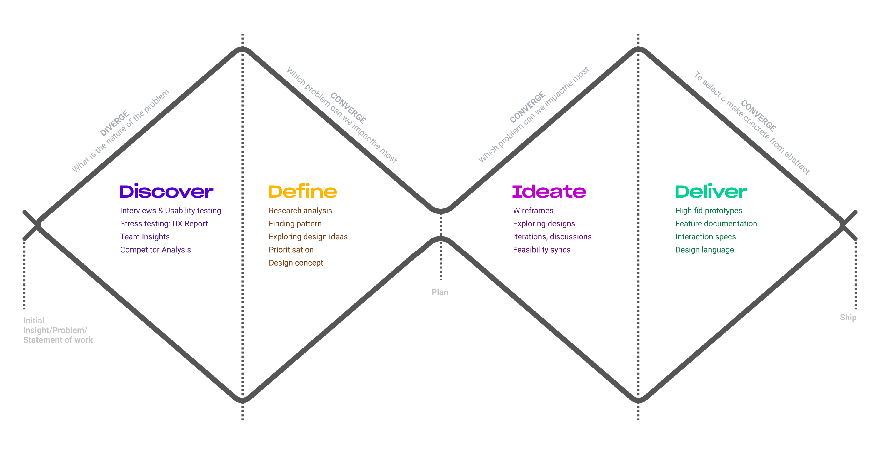
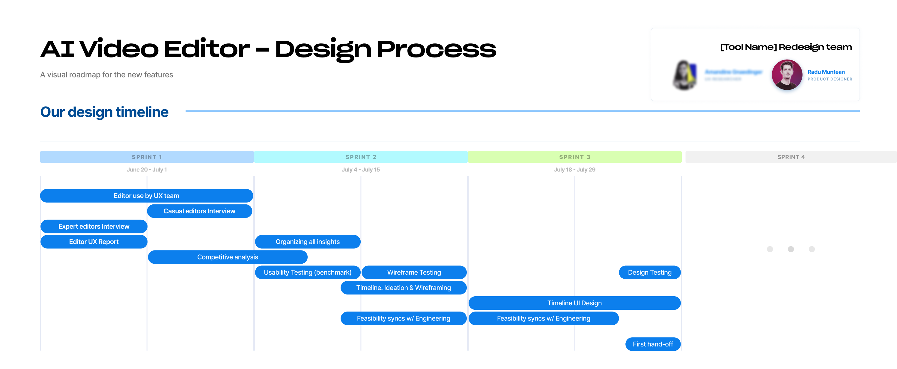
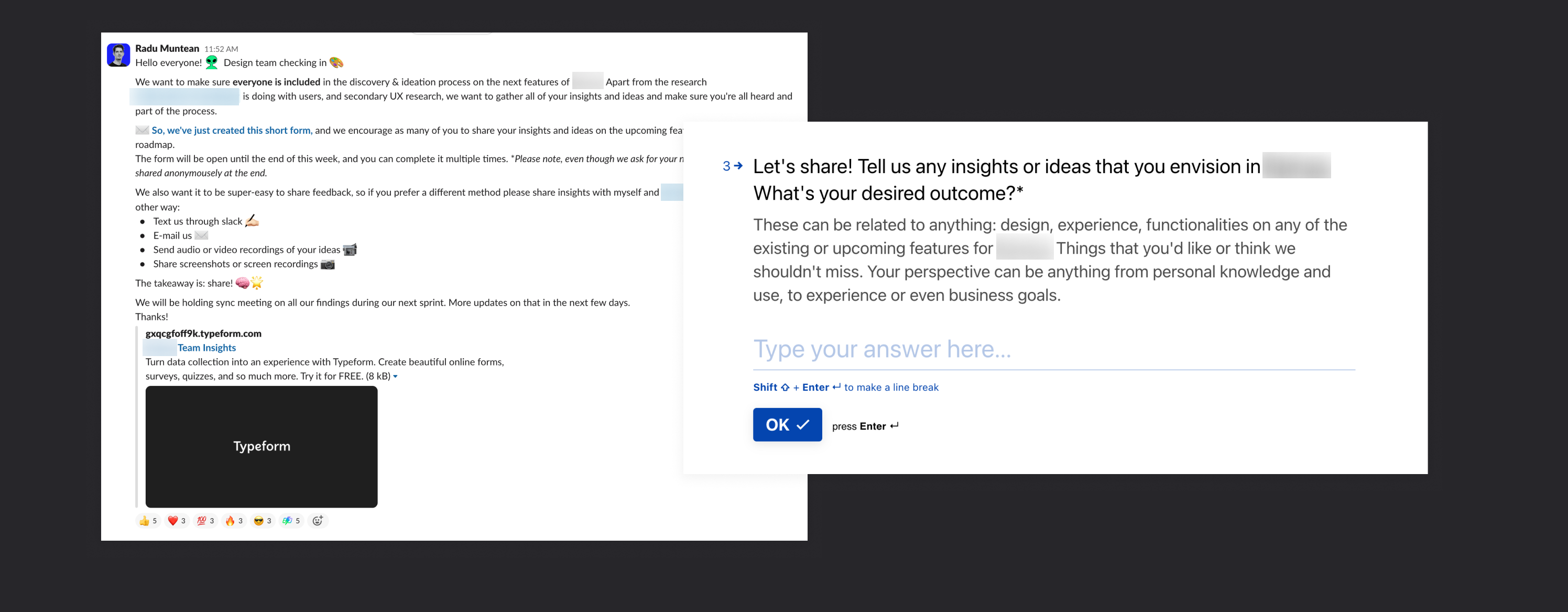
Spread out into multiple research areas, split based on each member’s expertise.
Converge together, analyze, and present all the information gathered to stakeholders, prioritizing must-have features & improvements.
Spread out, ideate design solutions, test out ideas – and discuss feasibility or issues.
Focus on the best ideas, creating high-fidelity designs & tests with users.
03
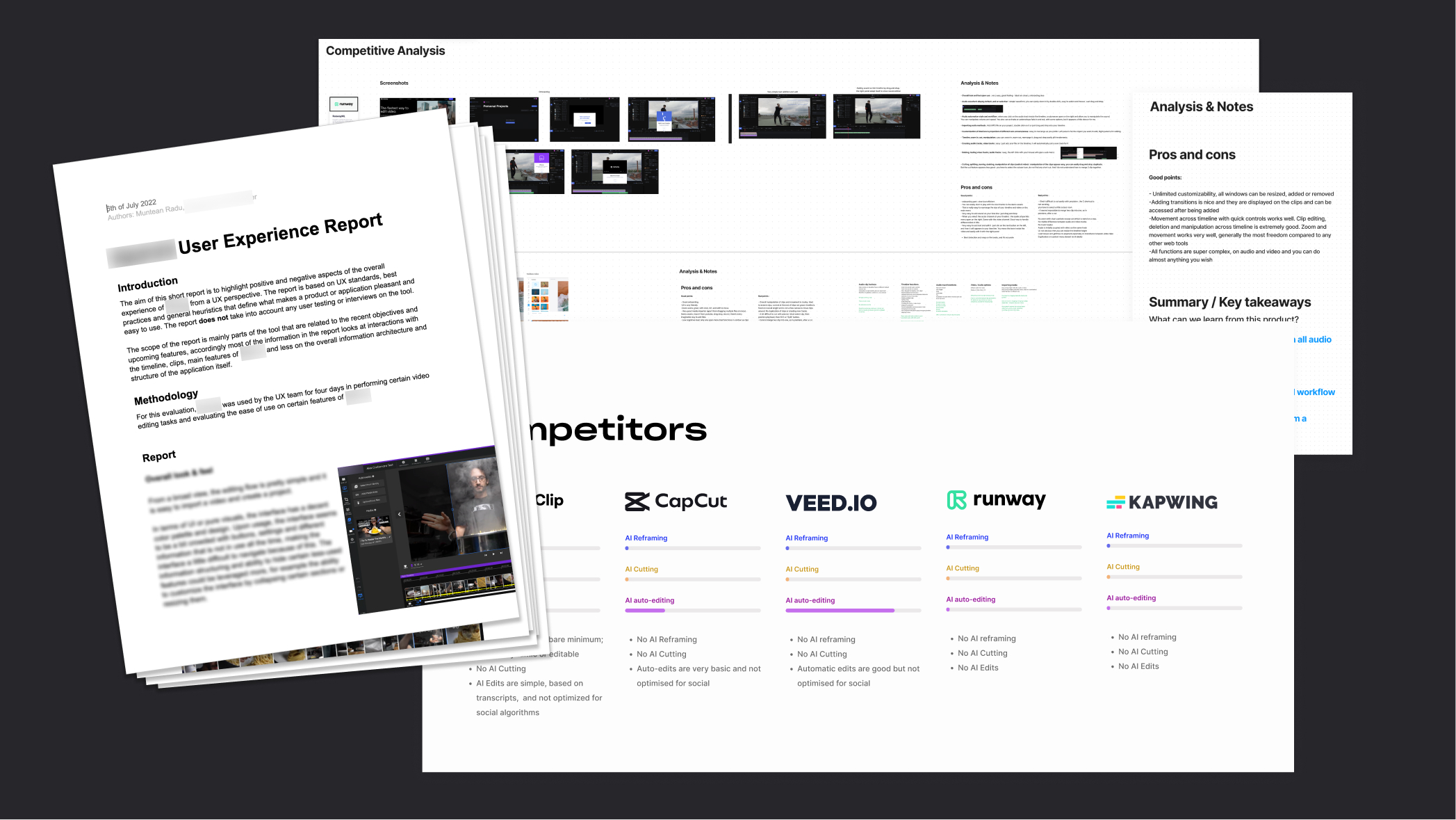
RESEARCH
We had an end goal and some basic directions – but what do we actually design?
We wanted to create with purpose and have a good understanding of the present, so we can build for the future. We split our research into four main categories.
04
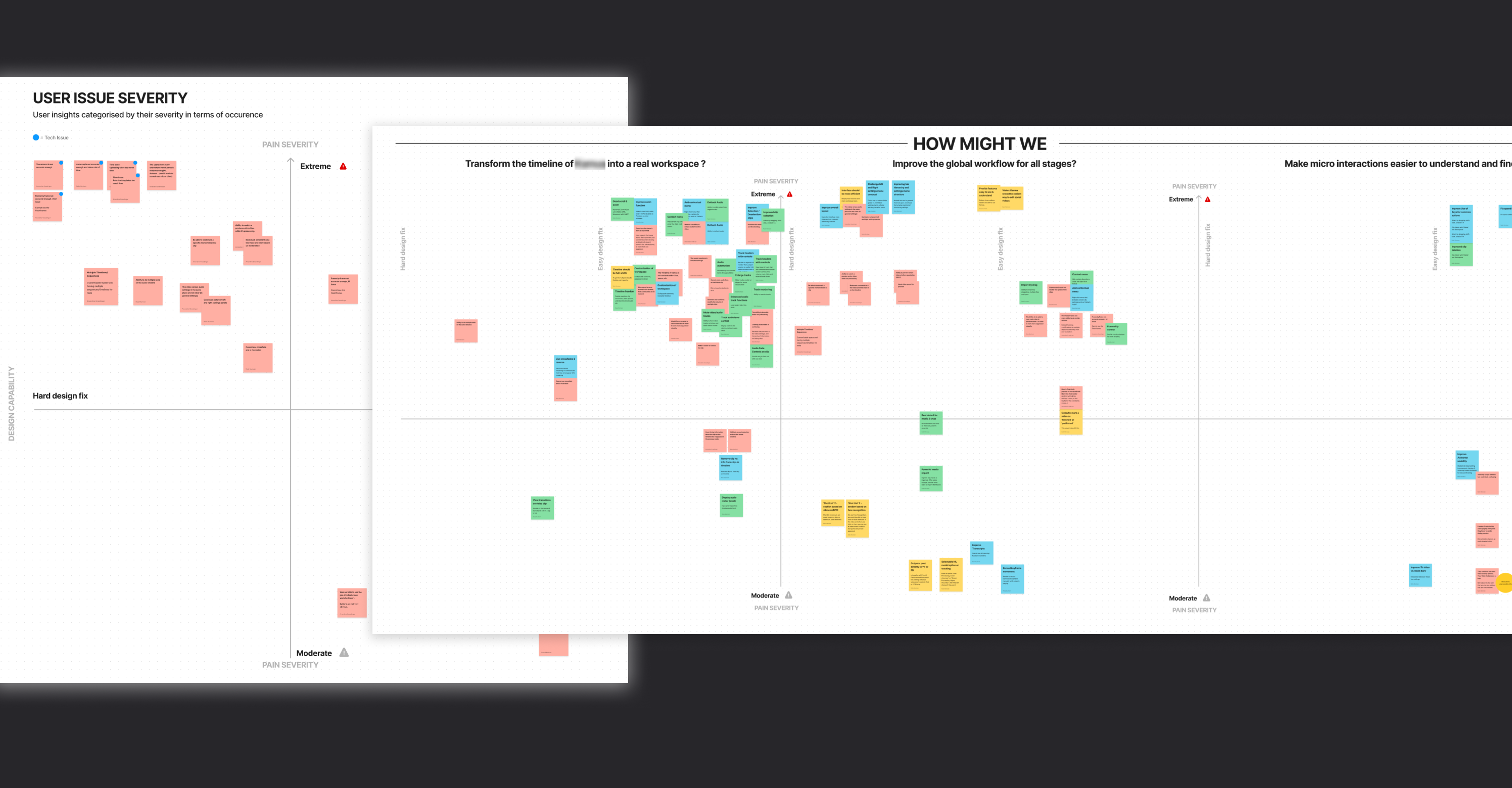
PRIORITIZE
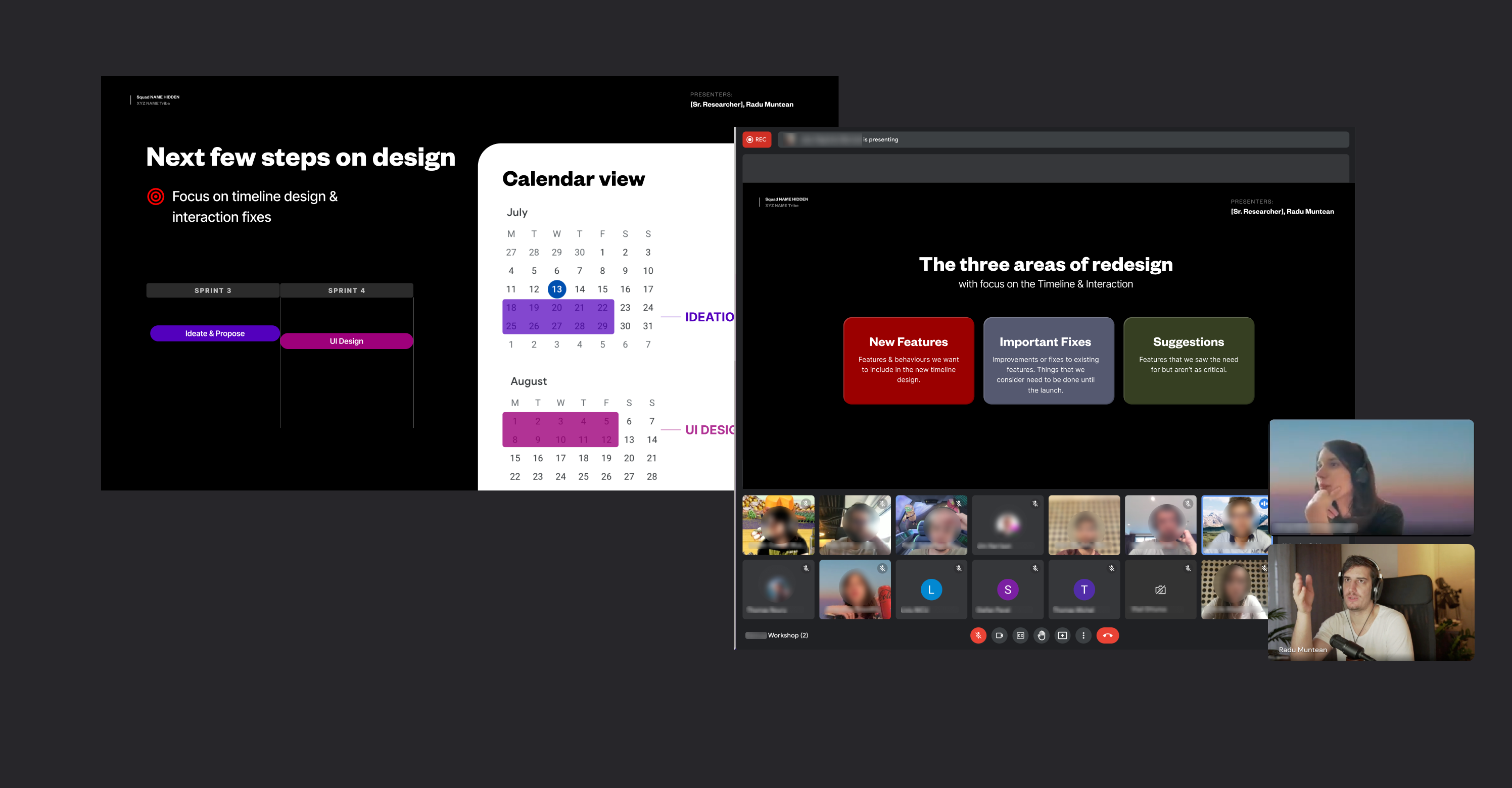
With research collected, we conducted a cross-analysis and identified patterns that helped us shape the MVP. We prioritized using “How might we” statements, cross-examining the multiple research points into patterns that determined the big bets the solution needs to include.
Based on the findings, we presented a design concept to the team, discussed feasibility, and established a possible roadmap.
05
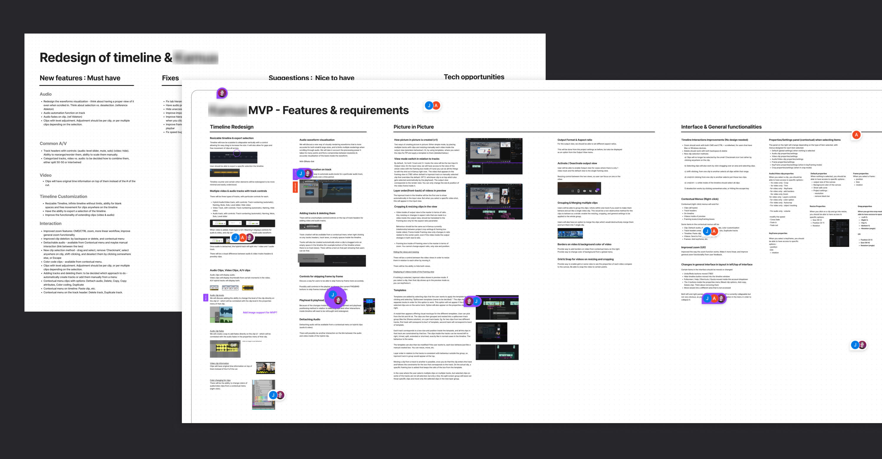
DESIGN
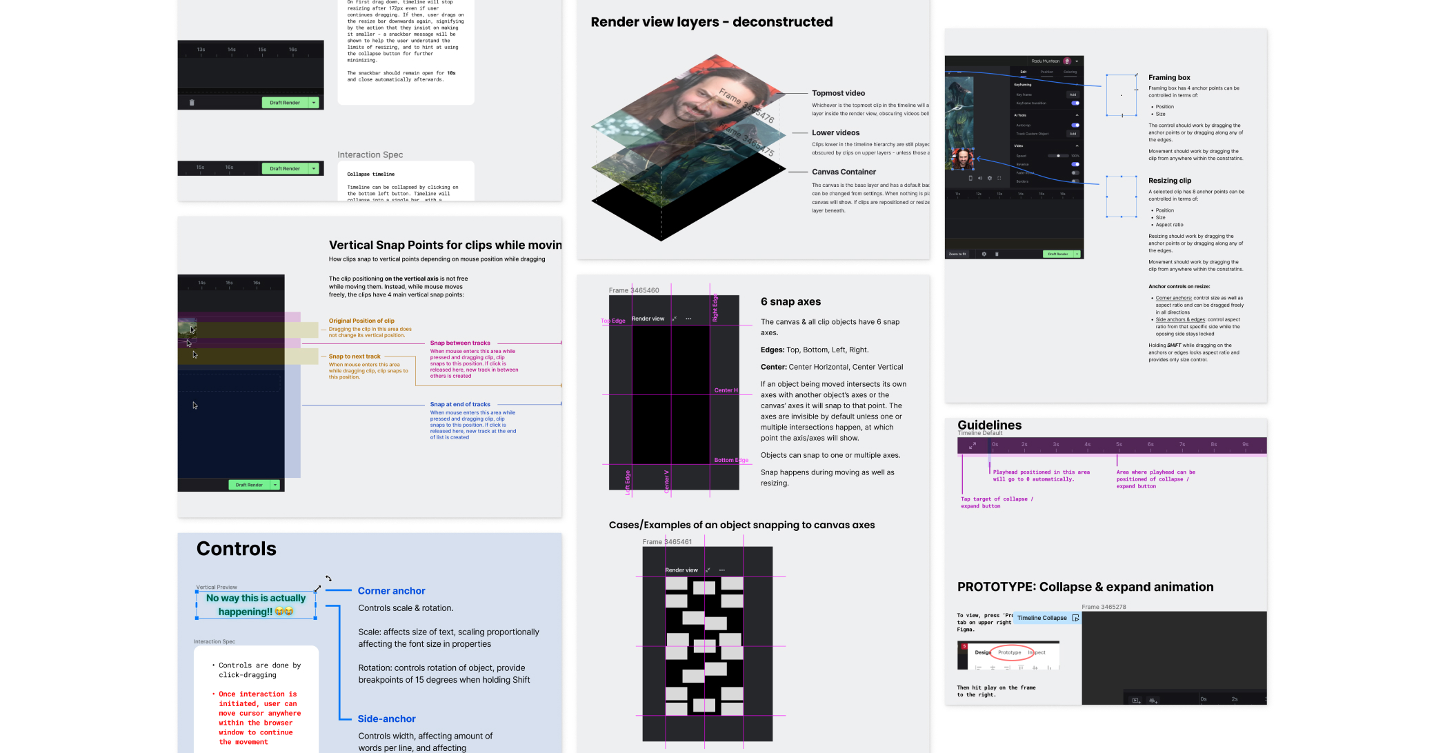
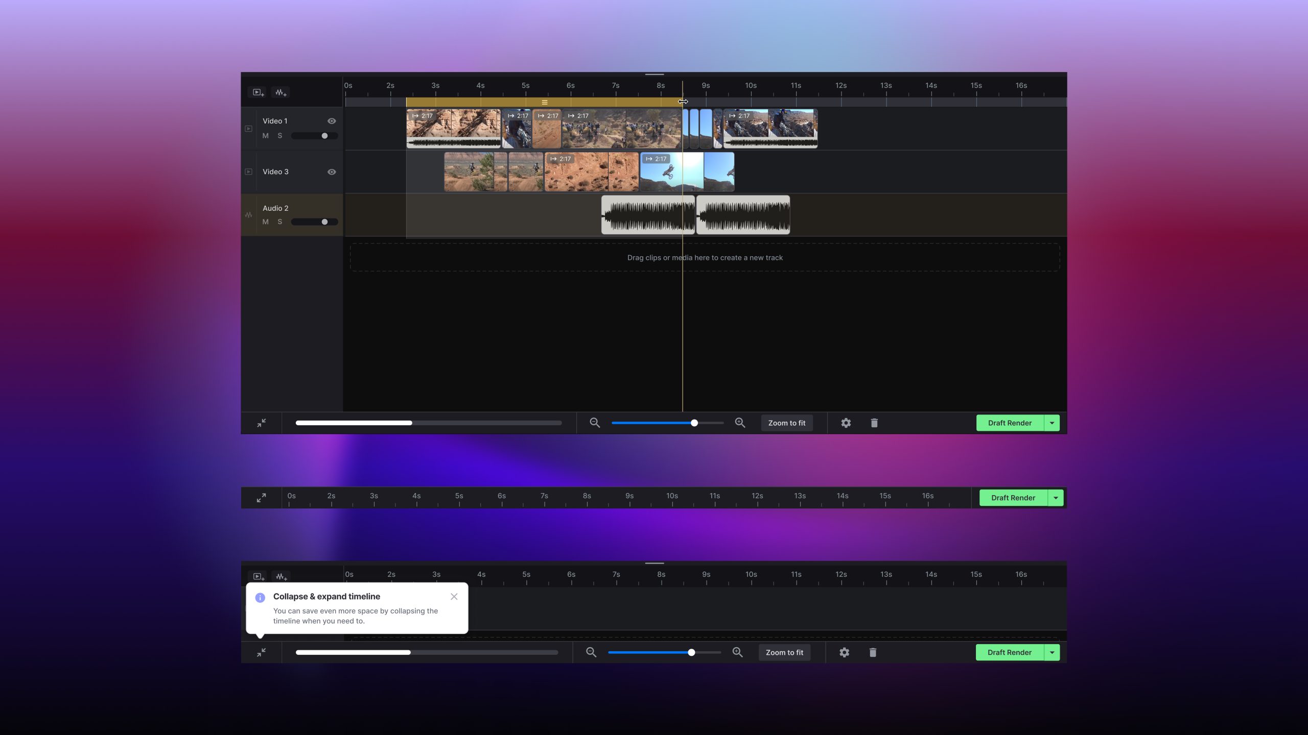
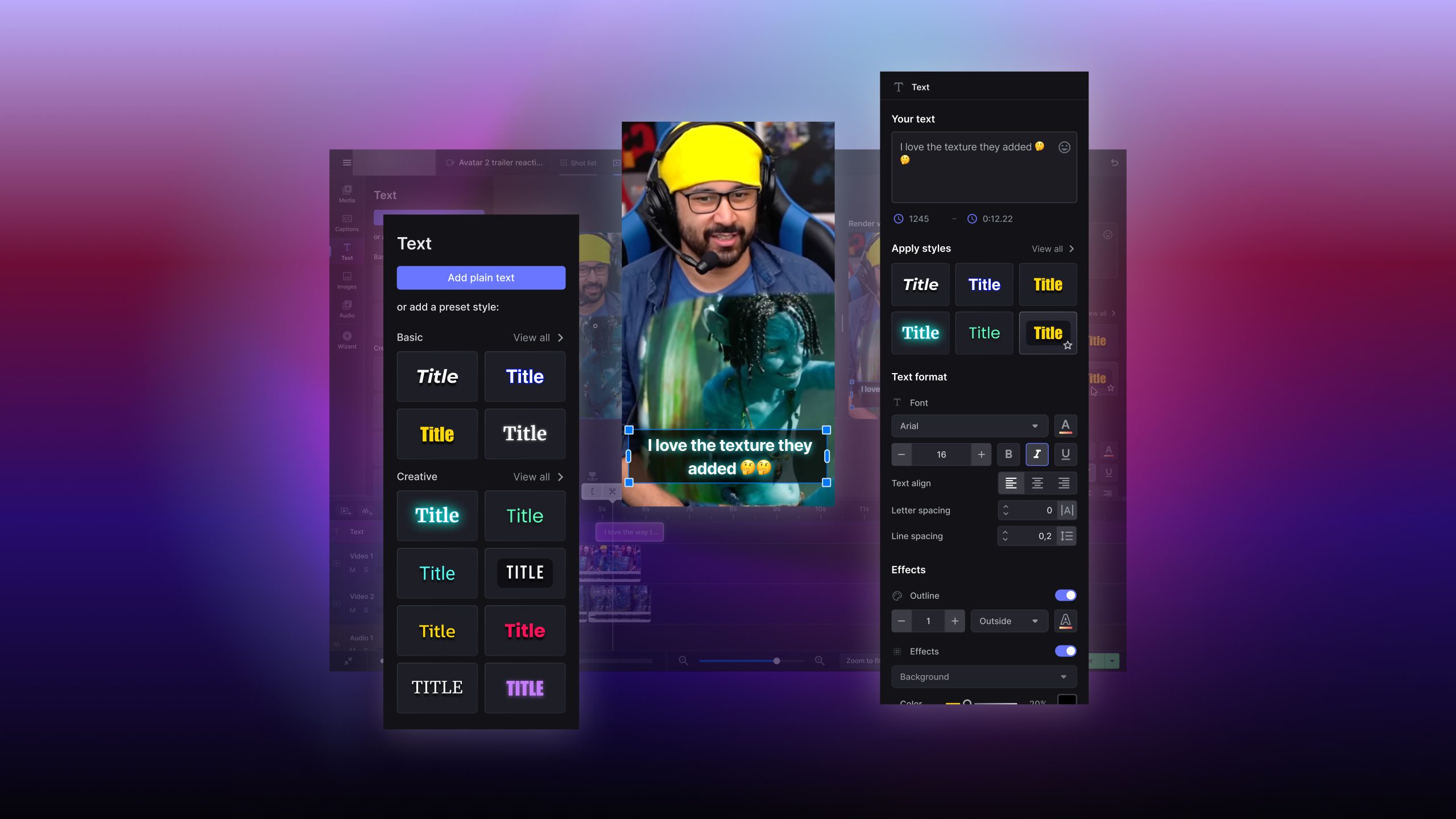
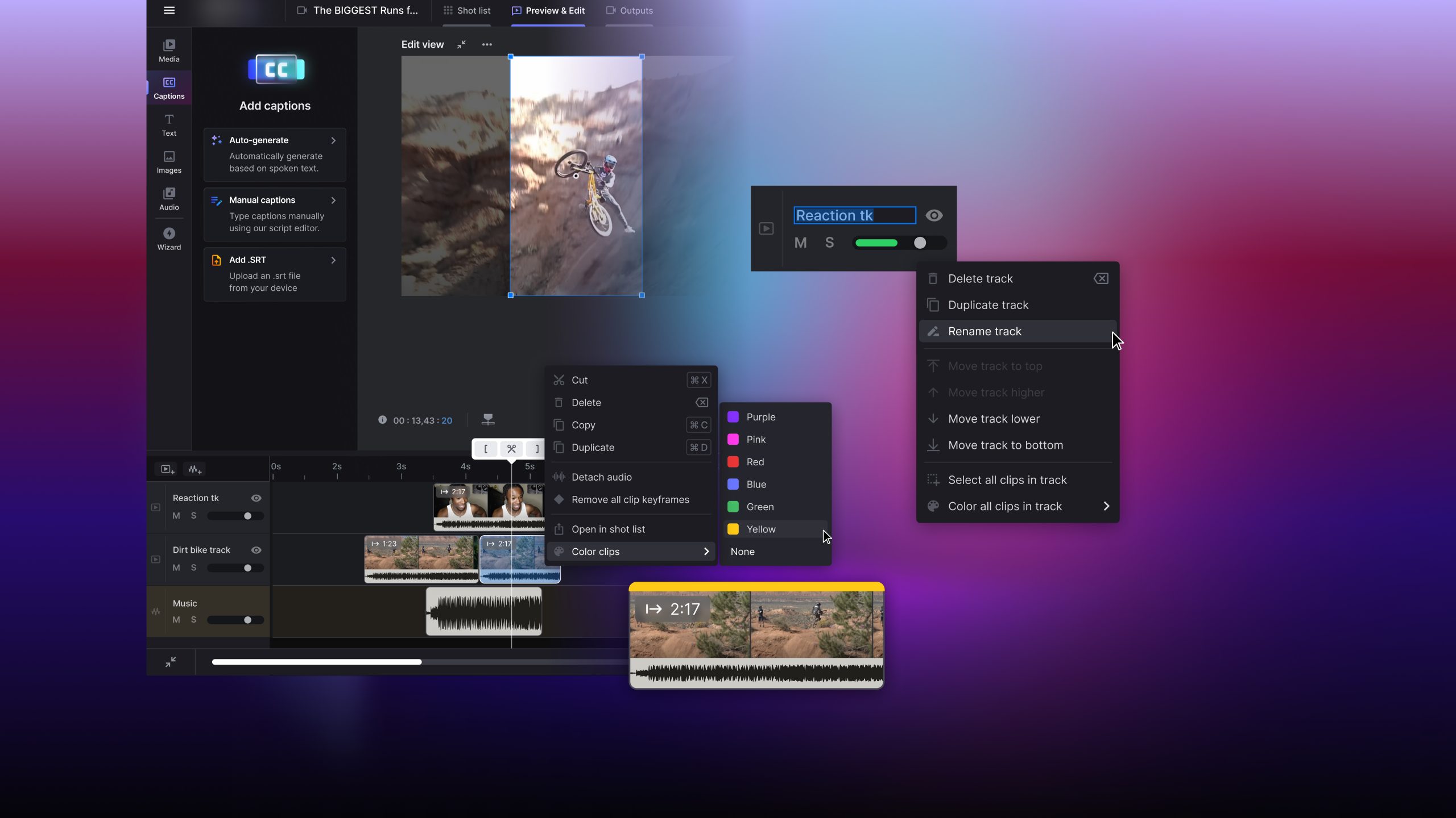
The new design focused on creating an improved timeline that enabled Picture in Picture, split screens, and many other improvements that offered much-needed freedom to users editing.
05
DESIGN
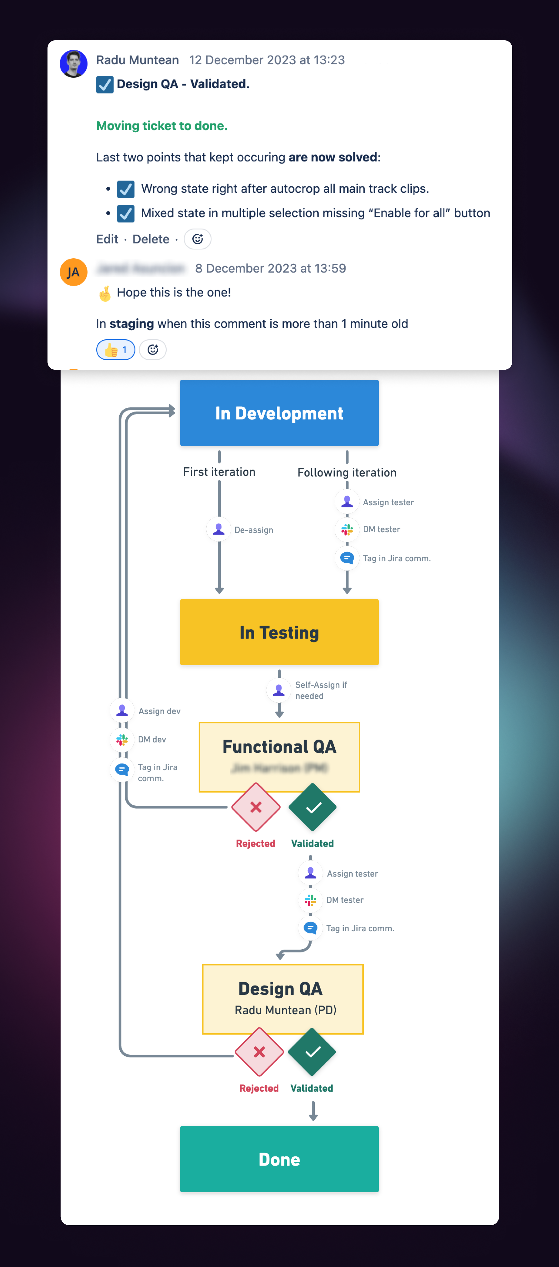
We established a rock-solid QA process led by design – where the final greenlight of all design tickets was solely managed by the design department.
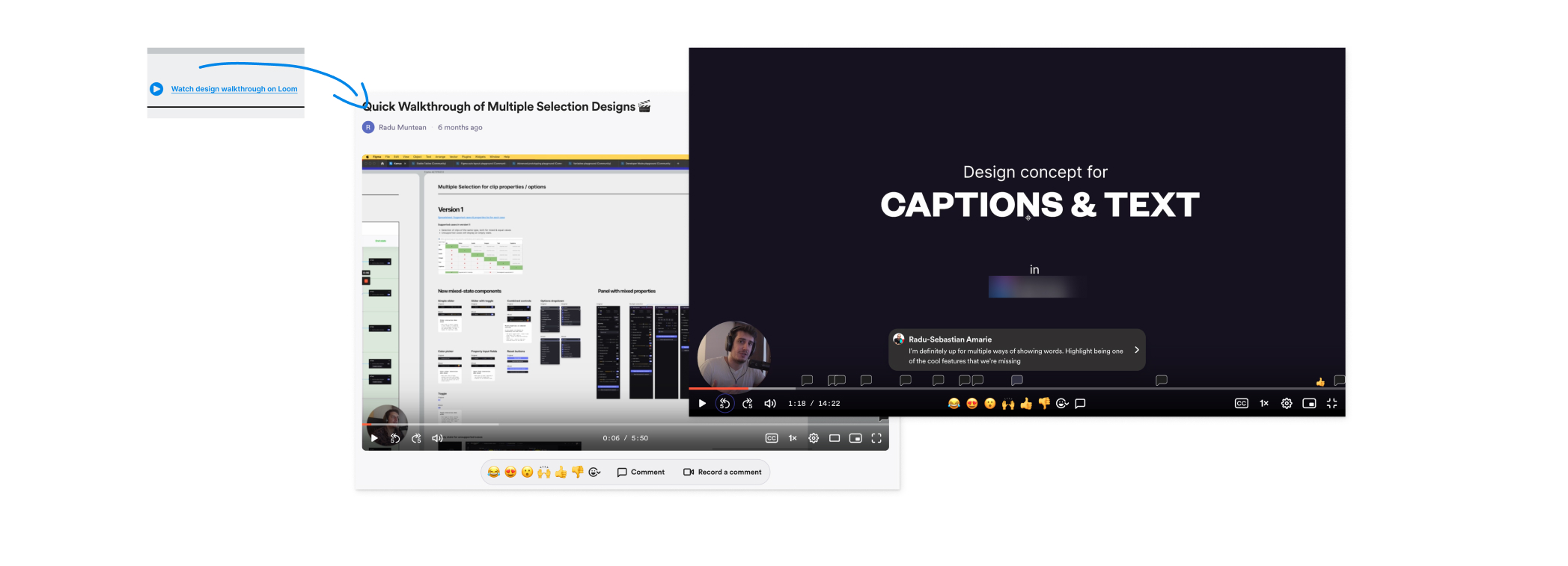
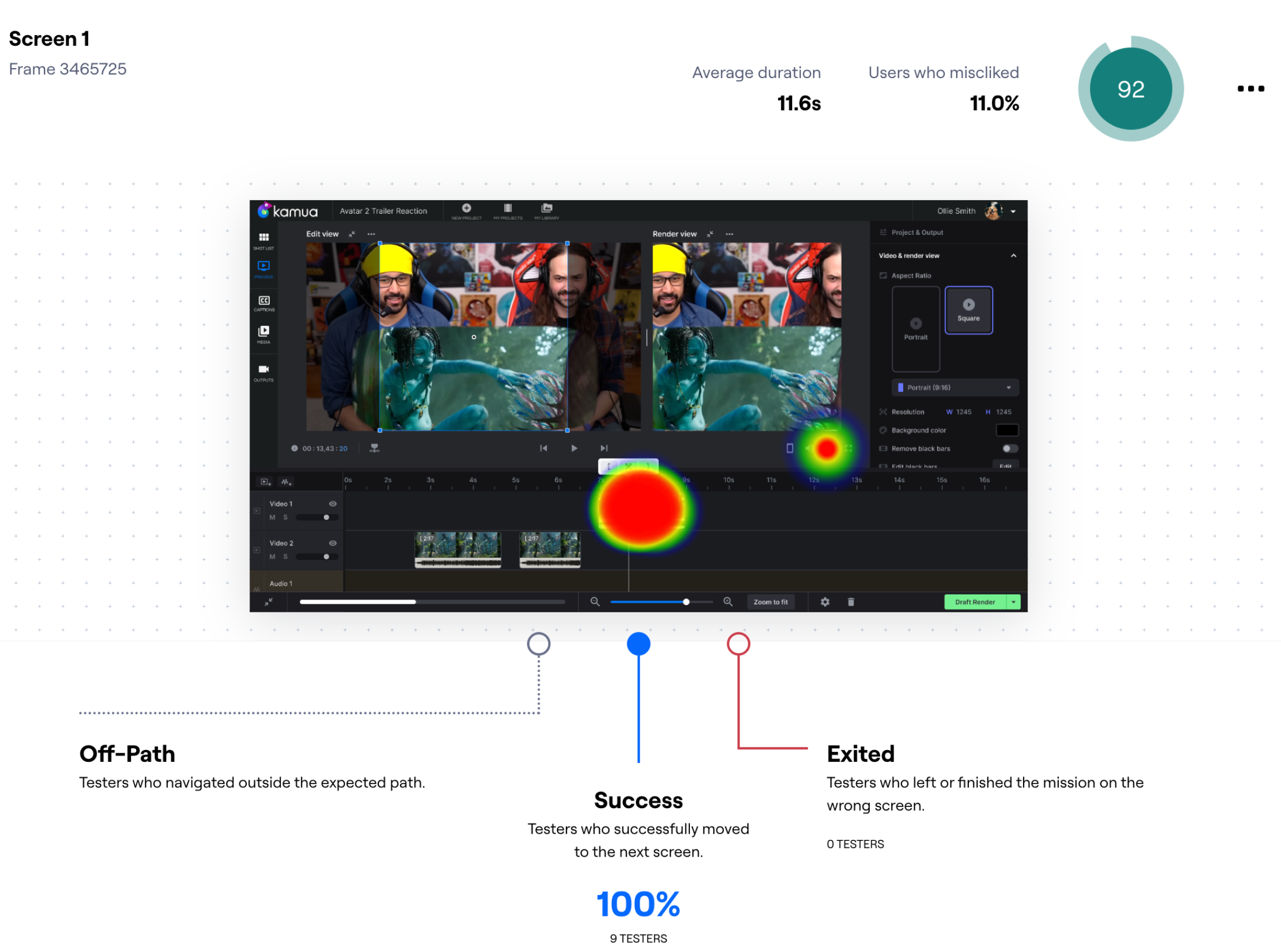
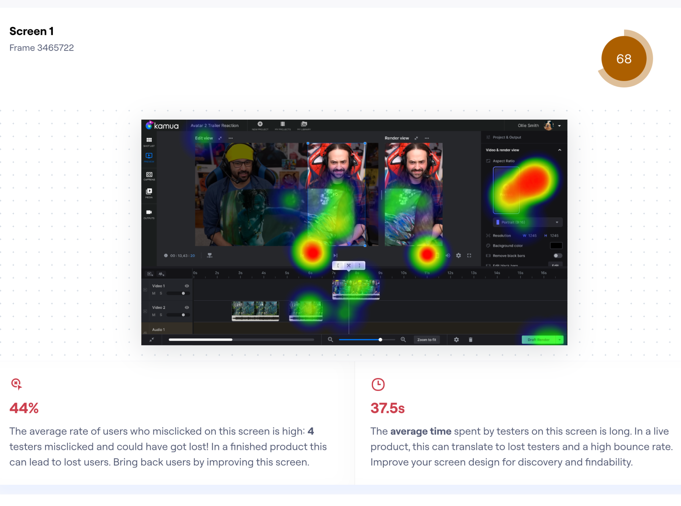
We also systematically fine-tuned designs on the drawing board before any time was spent implementing – using various methods to test our designs, from unmoderated prototype testing using MAZE to in-person concept testing and interviews.
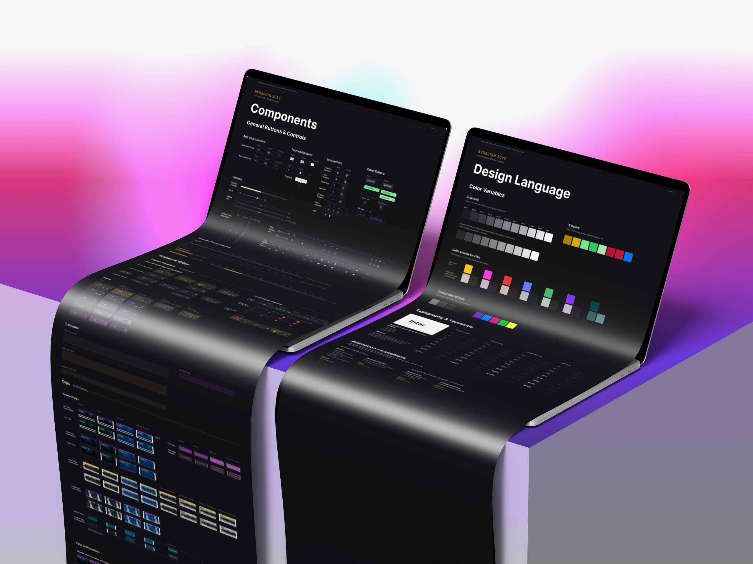
I strived for a solid delivery style consisting of design screens accompanied by interaction specifications and thorough feature documentation.
All of this, backed by recorded design walkthroughs that the developers could access at any time to better navigate designs.